Callia Magna
The Bodegas Callia vineyard takes its name from an old story about Callia, a young woman from Italy. She travels to San Juan and is enchanted by the beauty of the region and the wonder that this desert-like environment is a paradise full of fruit. The name Callia still stands for hoop, perseverance and success for the Argentine people.
The Dutch wine investor Mijndert Pon saw potential in this alluvial mountain range. The soil has various mineral compounds and stones such as limestone, flint, but also sand, silt and clay. The combination of the soil types ensures freshness and high concentration in the grapes. The harder the grape has to work, the tastier the wines.
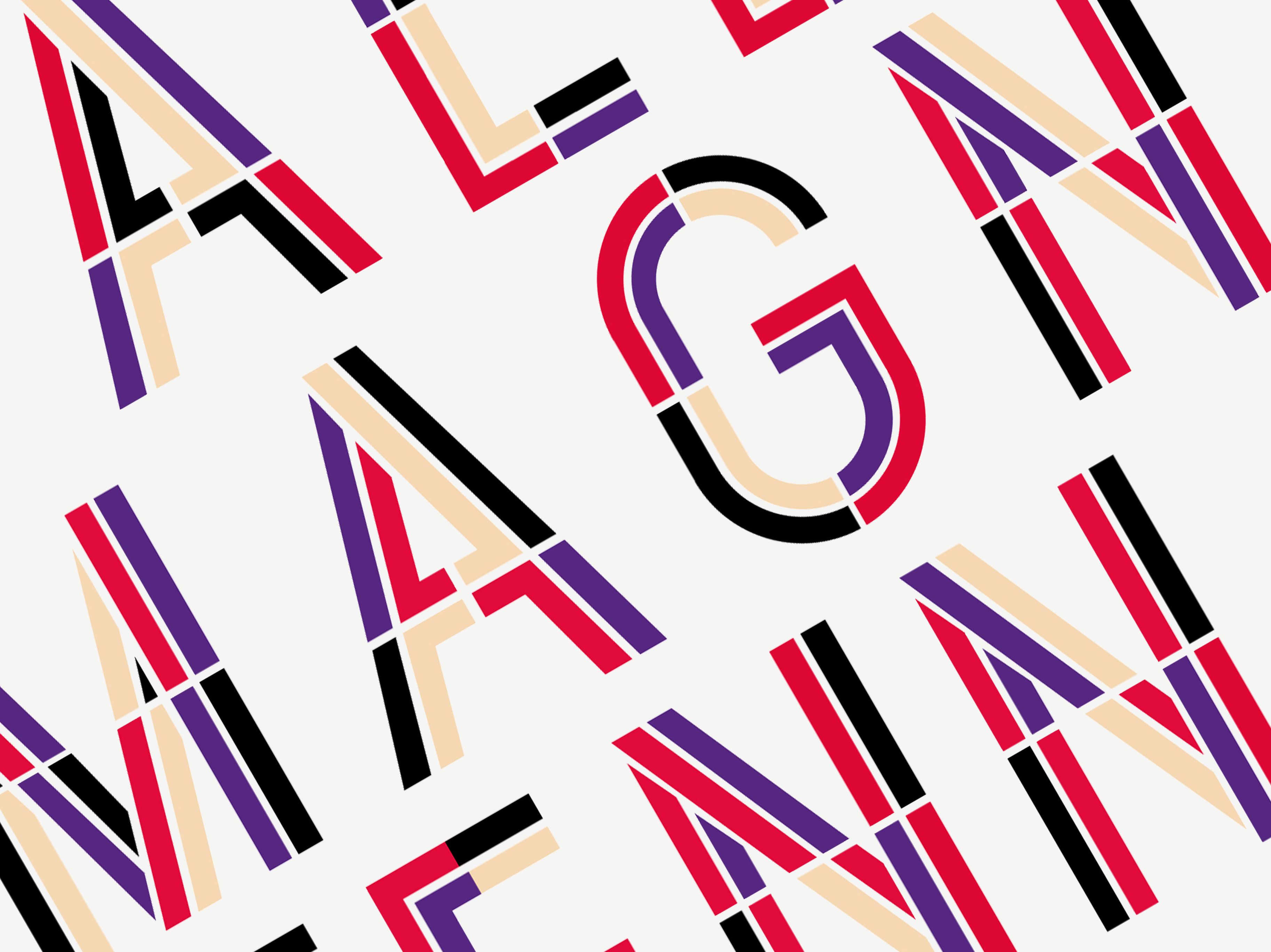
Inspired by the incredible background story of this wine and the Mexico 68 Olympics typography by Lance Wyman, I created a font and brand identity that represents the Callia Magna story. For the use of colors, I went back to the characteristics of the wine: red-purple-colored, aromas of red fruit combined with spices, licorice, vanilla and coconut. Grapes want to protect their seeds and vine and they do this by thickening the skin as needed. That is why I choose to visually show all the things responsible for the expressive and intense taste of the wine: vineyard, valley, wine branches, etc.
SERVICES
Packaging Design, Print Collateral, Photography, Sourcing


© Emelie Vandewalle Studio, 2020. All rights reserved.